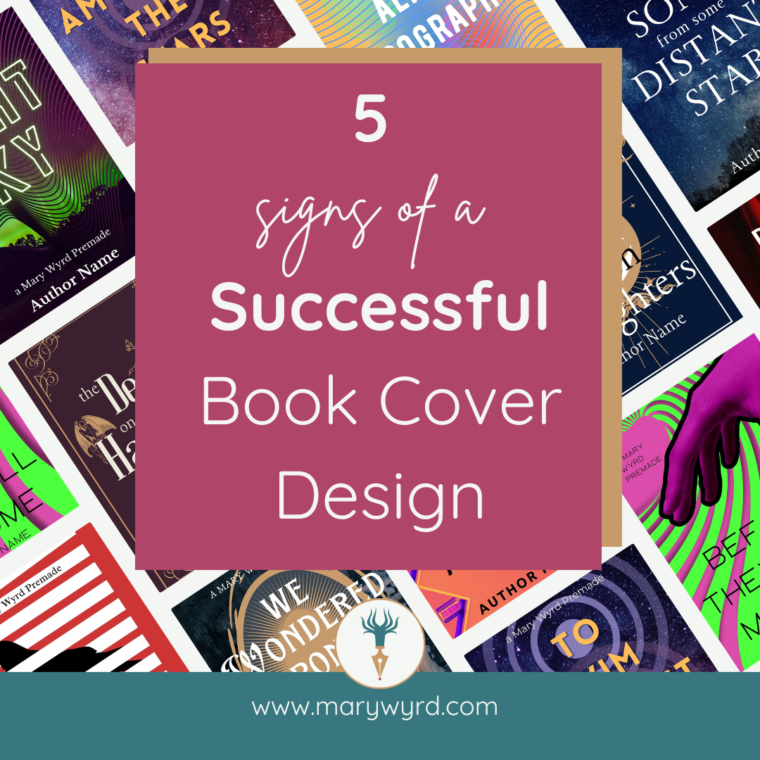
Five signs of a successful book cover design
Your book cover is your best marketing tool.
When you leave your book on a shelf or upload it to a digital bookstore, the cover is the first thing people will see. A successful book cover design attracts your ideal audience. Who are they? The people who want to read what you’re writing. But you only want the right kind of attention.
This guide is aimed at self-published authors and indie authors because you are responsible for every element of your book, including the design of the book cover.
Many traditionally published authors will have their book cover design managed by their publisher. Your self-published book needs to hold its own next to traditionally published works.
Unfortunately, some people still assume that a ‘self-published’ book is not as good as a traditionally published book just because it’s self-published. We know that’s not true, but we still have to work that bit harder to get past some people's prejudice. The first step? An awesome book cover. What makes a successful book cover design?
There are five elements that your book cover needs to have to make it stand out to the right people for the right reasons; five signs that a book cover design will be successful.
5. Communicates the genre
Each genre has an existing visual language. Understanding and utilizing this visual language will help your book cover do its job and attract your ideal audience. Even if you want to stand out, let’s do it right. Knowing the visual language of your genre will help you know which features you should keep and which rules you can bend.
If you’ve written an epic fantasy with dragons, a dragon on the cover is the quickest way to shout ‘this book has dragons’. This will make fans of fantasy and dragon stories pause.
Style trends change over time and visual language evolves. A dragon from a 1980s book cover is a different beast from a dragon on the recent bestsellers. Even if your story is inspired or influenced by older genre traditions, there’s no reason to use dated design.
If you already have some book cover design ideas, see how they compare to contemporary designs in your genre or, even better, in your subgenre. A quick way to do this is to look at best-selling traditionally published book covers.
Why look at traditionally published book covers when you’re self-published? These covers have already had input from multiple professionals before the final design was chosen. They also tend to use the most recent visual language and trends in the genre. The key is to be inspired by and not to copy.
Take a look at websites where your genre is sold. Which book covers in your genre catch your eye? Save them in a file on your computer or create a Pinterest board. When you have a good selection of existing book designs, look at them. What do they have in common? What could you use on your book cover that accurately reflects your book?
Knowing what images or symbols you want on your cover leads us to our next sign.
4. High-quality artwork
We’ve all seen images that look off or wrong somehow. Curious, we take a closer look. It’s then that we discover bad photo composition, accidentally blurred or pixilated images, and multiple unexplained light sources or perspectives. These days it can be the uncanny valley of AI-generated images. Tell-tale signs that the image was originally multiple photos or images merged into one can also make the cover look unprofessional.
Although these all grab our attention, it’s for the wrong reasons. People judge a book by its cover. A book cover that looks unprofessional or cluttered will make potential readers think the same level of attention was paid to the contents. A book cover that uses AI-generated images can make a potential reader think that the book contents could also be AI-generated. And not many people want to read that. Some people refuse to interact with any book sporting an AI-generated book cover.
Your photos should be crisp and clear with light sources that make sense. A composite image needs to be convincing and look like one, single image. Custom artwork needs to be created to a size and format that will fit on or be easily shrunk to fit a book cover rather than too small and it has to be stretched.
A book cover also needs words. The next decision is just as important as choosing the right images or icons but is too often neglected.
3. The right Type
Typography is the art of arranging letters and text in a way that makes the copy (words) readable and visually appealing. Typography plays a vital role in design, especially book cover design.
Typefaces (style of lettering) form part of the visual language of your chosen genre. Slapping any old typeface or font (variation of a typeface) on a cover just won’t do. Like images that just look wrong, a font chosen at random will look out of place. Readers will notice. If no thought has been given to the letters on the cover, what hope have the words inside?
Take a look at the book covers you’ve already found. What styles or fonts do they have in common? Is the same font used for the title and the author's name, or are they different?
You don’t need to know the names of all the typefaces or fonts. Over time you will recognize the look of fonts used in your genre. And those that are avoided in book cover design (Comic Sans.)
Usually, the fonts chosen are easy to read so people can easily tell the name of the book and the author. Even fancy script fonts, those that look like cursive handwriting with extra flourishes, lean towards typefaces that are easiest to read.
It’s all about balance, all the elements working in harmony with each other.
2. Balanced at any size
All the elements of your book cover need to work together to tell your potential buyer a story. What you want them to take away is, well, your book. But not everyone is ready to buy straight away.
This is where visual hierarchy comes in. Actually, it should already be working. Visual hierarchy helps your reader know where to look first and how to read the full picture. In this case, the full cover. The first thing you want them to look at is usually the most important design element.
There are different ways to do this.
A bold font, for example, suggests ‘read me first’ when next to a regular font.
A large image of a dragon right in the center of the image also says ‘read me first’ or, in this case ‘look at me first’. Perhaps the tail of the dragon is part of the title or points to it, leading the reader to the second thing they should ‘read’.
Don’t forget color.
Take a look at the colors used on book covers in your genre or your existing cover art. What is the main color being used?
Use a Color Wheel to try out different colors that will work with the main color, for example, a complimentary color will be directly opposite your main color. There are other options too, like triadic and tetradic.
Knowing some basics about color theory and the meanings we give to different colors will help elevate your book design. If your book is an uplifting story, use warm tones to give a sense of positivity and warmth.
The design doesn’t stop at the front cover! Make sure the spine and back cover match the design style of the front cover. Look at the full cover as a single image. Does everything belong? The key is making sure all the elements are in balance and working together to sell your book.

An example of a full wrap premade book cover. Elements from the front cover, including the colors used and the font used for the author name are replicated on the back
If you’re not sure that the cover looks balanced, look at it upside down. This way, your brain isn’t trying to read the text or understand the image and you can see if something looks “off” or out of balance.
Something else you need to check is the readability of the whole design in miniature. When scrolling online, a potential reader will only see a small or tiny version of your book cover. Is your book cover thumbnail still readable where it counts? Either the title can be read even when it’s tiny or the main design elements are clear enough to grab attention. If the answer is yes, you’re probably on to a winner. That’s when you add the final piece of the successful cover puzzle.
1. An engaging, spoiler-free blurb
This is where you seal the deal. Your ideal reader has found you thanks to your amazing cover. Now you need to sell your whole story in a few words.
If you’re just designing an eBook cover you’ll still need a captivating description or blurb to go alongside your cover. People want to know what your book is about. The cover gave clues, now they need to know.
Your blurb needs to be a captivating summary of your story without spoiling plot points or giving away the ending. If your book is part of a series, you need to ensure you avoid spoiling the earlier part of the series. This seems like common sense but it happens far more than it should.
Condensing the soul of your book into a few paragraphs for a blurb isn’t easy. If you’re a plotter or a planner, look at your story outline. If this still reflects your book, use it as a starting point for your blurb. If you’re a pantser, write down the outline of your story to use as a template for your blurb.
The first line is key. Use the first line and paragraph as a hook to grab your reader. This is your chance to introduce your setting and your main protagonist or the people the reader will be spending the most time with. Give clear clues as to the genre and hint at some of the tropes you’ve used to make your reader eager to learn more. They can only learn more by…reading your book!
Once you have a draft you’re happy with, get feedback. Ideally, share it with someone who has already read the book. They’ll be able to tell if the blurb matches the book without it giving away any spoilers. They may even have suggestions to improve your blurb.
Compare how your blurb is written to recent bestselling or well-received books in your genre. Why only recent books? Just as visual genre language changes over time, the way blurbs are written also changes. Imitating but not copying these blurbs will ensure your book description sounds fresh and current.
Once your blurb is polished to perfection, add it to your cover design or prepare it for posting.
Make it happen: how to get a great book cover design
Overall, a successful book cover design needs to look professional. The best way to make sure that your book cover has all these elements is to hire a professional book cover designer. There are various options open to you:
Premade book cover
A good premade cover should have most of the elements for a successful book cover design. All it needs is to swap out the existing title, author, and blurb for your title, name, and blurb. Most premade covers are retired once they’ve been bought. However, some covers are not retired and are sold multiple times. You must check with your chosen designer or company to confirm their process.
Custom design book cover
Hire a professional to design your entire book cover. This way you’ll be able to put elements from your book into the cover design. A designer will offer a certain number of edits and revisions to make your book cover. If they have suggestions on your design, listen. They are the expert in this situation and, although you are the expert on your book, a great designer will know how to make your cover sing.
Collaboration
Artists or illustrators can be hired to create book cover art, either premade or custom. You could hire an artist or an illustrator to create the artwork. Once you have bought the art, you can hire a professional book cover designer to complete your book cover design.
DIY (Do It Yourself)
If you have no budget and have chosen to design your own book cover, the tips in this blog will help you. When you have a few designs you’re happy with, share them with people you trust for feedback. You could also take them into bookstores and libraries to ask if these covers would work well in your genre. Booksellers and librarians are experts in the field of books and will have seen thousands of book covers in their careers. They will have a good idea if your cover is right for your genre.
If none of your covers are working, it might be time to pause so you can save up to hire a professional.
The importance of a book cover that looks professional cannot be overstated. It’s your book’s first and best marketing tool. A bad cover will turn away potential fans. You’ve worked so hard on your book, it deserves a book cover that will do it justice.
Mary Wyrd: Creative Virtual Assistant
Need feedback on your cover before it goes to print? Get in touch and I’ll give you some advice.
Want a premade book cover with promotional graphics to market your book? Hit the button.